Add YouTube and MP4 Videos to WooCommerce Product Gallery

Are your product images doing enough to convert customers? Are your product images really enough? Be honest. When you land on an online store, scroll through a few pictures, and read a block of text, do you feel convinced? Or do you hesitate? Most shoppers hesitate. They want to see the product. In motion. In real life.

I once worked with a small online electronics store. Great products. Clean website. Decent traffic. But sales were flat. We added one simple thing, a short product video. Nothing fancy. Just a 60-second YouTube demo showing the device in use. Conversions jumped. Not doubled overnight, but noticeably improved. Customers stayed longer. They asked fewer pre-sale questions. It changed everything.

That’s the power of video. And in WooCommerce, adding YouTube and MP4 videos to your product gallery is no longer complicated. It’s practical. It’s strategic. And honestly, it’s expected.


Why Add Videos to Your WooCommerce Product Gallery?

———————————

Because people don’t read. Not much anyway. They scan. They scroll. They judge in seconds. A photo shows a moment. A video shows a story. A jacket on a hanger looks fine. A jacket worn by someone walking outside? That feels real. A blender in a static image is just metal and glass. A blender crushing ice in 10 seconds? That’s convincing.

Videos increase confidence. Confidence reduces doubt. And doubt kills conversions. There’s also psychology involved. When customers watch a product in action, they mentally “own” it for a few seconds. That tiny emotional shift matters. It creates a connection. Subtle. Powerful.

And let’s not ignore something important: reduced returns. When shoppers clearly understand size, features, texture, and usage, they are less likely to say “this isn’t what I expected.” Video removes assumptions. It also increases time on page. Google notices that. Engagement improves. Rankings sometimes follow. It’s not magic. But it helps.


YouTube vs MP4: Which Option Should You Use?

———————————

This question comes up a lot. And the answer is, it depends. YouTube is easy. Upload once. Embed anywhere. It handles compression, bandwidth, and streaming quality. Your server doesn’t struggle. Visitors from different countries still get smooth playback. That matters more than people realize.

But YouTube has branding. Suggested videos. Sometimes distractions. You don’t fully control the environment. MP4 self-hosted videos are different. Cleaner. More professional. No external branding. You control the experience from start to finish. It feels premium.

However, there’s a catch. Hosting videos on your own server can slow things down if not optimized properly. Large files eat bandwidth. Poor compression kills page speed. And page speed is everything in eCommerce. So, what’s better?

If you want performance and simplicity — YouTube.

If you want control and branding — MP4.

Many stores actually use both. Overview video on YouTube. Detailed product demo as optimized MP4. Balance is key.


Methods to Add YouTube and MP4 Videos to WooCommerce Product Gallery

———————————

There are different ways to do this. Some simple. Some technical. Some require plugins. Some don’t. The easiest route? A plugin designed specifically for video integration. A proper WooCommerce Product Video solution allows you to insert videos as featured media, inside the gallery, even on shop pages. No coding. Just configuration.

You install it. Activate it. Then, inside the product edit screen, you see new options. Choose video type. Paste YouTube URL. Or upload MP4. Done. It feels smooth. Organized. Intentional.

Of course, you can also manually embed videos in product descriptions. WordPress makes YouTube embedding easy; paste the link. But it won’t integrate perfectly into the product image gallery slider. It looks separate. Slightly disconnected. If presentation matters (and it does), using a proper gallery integration method is worth it.


Adding Videos as Featured Product Media

Imagine a customer lands on your product page. Instead of a static image, they see a short video preview. Muted. Smooth. Clean. They click. It plays. The product rotates. Moves. Functions. Suddenly, the item feels alive.

Using video as a featured product media grabs attention instantly. Especially for high-ticket products. Electronics. Tools. Furniture. Fashion.

But be careful. Autoplay with sound? Bad idea. Annoying. Always keep it muted by default. Let the user choose to engage deeper. And always add a strong poster image. The thumbnail matters. It’s the first impression before the video even starts.


Adding Multiple Videos to the Product Gallery

One video is good. Two can be better. Three might be too much. Start with a short overview. Then a detailed feature explanation. Finish with a quick testimonial or usage demo. That’s enough.

I once saw a product page with eight videos. Eight. It was overwhelming. Customers don’t want a documentary. They want clarity. Keep videos structured. Logical. Purpose-driven. Don’t just add them because you can. Add them because they answer real customer questions.


Optimizing MP4 Videos for Performance

This is where many store owners make mistakes. Big mistakes. Uploading a raw 200MB video file directly from a camera is not a strategy. It’s sabotage. Compress your videos. Use tools like HandBrake. Reduce bitrate. Keep quality acceptable but efficient. 720p is usually enough. 1080p is fine. 4K? Rarely necessary for product demos.

Short videos load faster. Fast-loading pages convert better. It’s simple math. Also consider lazy loading. Let the video load only when needed. And if traffic grows, use a CDN. It distributes the load. Keeps things smooth globally. Performance is invisible when it works. But painfully obvious when it doesn’t.


Best Practices for Product Videos

Keep it short. Really short. Attention spans are shrinking. A 45-second video that delivers value beats a 4-minute ramble. Show the product in real scenarios. Hands using it. Someone is wearing it—a tool solving a problem and not just spinning in a white background.

Good lighting matters. Clear audio matters more. Bad sound makes even premium products feel cheap. Add subtitles. Many people watch without sound, especially on mobile. And remember, authenticity wins. A slightly imperfect but honest demo often performs better than an over-produced commercial. Customers trust real.


Mobile Optimization Considerations

Most shoppers are on their phones. Waiting in line and sitting on the couch. Half distracted. Your videos must be responsive. They must scale properly. Controls should be easy to tap. Autoplay should be muted. Always. Test everything on mobile before launching. What looks perfect on a desktop might break on smaller screens. Mobile optimization is not optional anymore. It’s standard.


SEO Benefits of Product Videos

Video improves engagement. That’s the first benefit. When customers stay longer on your page, search engines interpret that as relevance. Not always directly. But indirectly, it matters.

YouTube adds another layer. A well-optimized video can rank independently. Driving additional traffic to your store. Use proper titles. Clear descriptions. Relevant keywords. Add links back to your product page.

Structured data can help search engines display video snippets in search results. That increases click-through rates. Small adjustments. Big impact over time.


When Should You Definitely Use Product Videos?

If your product requires explanation, use a video. If your product is expensive, use video. If your product has moving parts, installation steps, unique textures, or transformation effects, definitely use video. Electronics. Fitness gear. Beauty tools. Furniture assembly. Even clothing fit demonstrations. Some products almost demand video. Without it, customers feel uncertain. With it, uncertainty fades.


Conclusion

Static images had their era. They still matter. But alone, they are not enough anymore. Adding YouTube and MP4 videos to your WooCommerce product gallery transforms the shopping experience. It makes products feel real. Tangible. Trustworthy.

It builds confidence. Reduces doubt. Increases engagement. Sometimes dramatically. You don’t need Hollywood production. You need clarity. Authenticity. Smart optimization.

Start small. Add one product video—measure results. Improve. Because at the end of the day, customers don’t just buy products. They buy understanding. And video delivers that understanding faster than anything else.

Read More
Sanju February 19, 2026 0 Comments

Why Role-Based Pricing Works Better Than Coupons in WooCommerce

Are coupons really the best way to offer discounts in your WooCommerce store, or is there a smarter, more scalable pricing strategy you could be using instead?

That question usually appears late at night. After a long day of orders. After answering the same customer email again. “Why didn’t my coupon work?”

Coupons feel safe. Familiar. Almost comforting. WooCommerce includes them by default, after all. But once a store starts growing more products, more customers, more expectations, those same coupons quietly turn into friction. Small at first. Then loud. Then expensive.

This is where role-based pricing quietly steps in. No flashing banners. No codes to remember. Just the right price, shown to the right customer, every time. Clean. Almost invisible. And that’s the point.


Understanding Coupons in WooCommerce

————————-

Coupons are rules. Conditions stacked on conditions. “If this, then that.” They were designed for promotions. Short bursts of excitement. A nudge. A reminder. Enter the code. Feel the win.

WooCommerce coupons usually work like this: Customer finds a code. The customer enters it at checkout. The system checks rules. Then apply a discount. Simple on paper. Messy in reality.


Hidden Problems with Coupons

————————-

1. Coupons Add Friction to the Buying Process

Every coupon introduces hesitation. Even loyal customers pause.

“Do I have a code?”

“Did I miss a discount?”

Now they leave the cart. They search emails. They open another tab. Sometimes they don’t come back. Tiny interruptions matter—a lot. Role-based pricing removes that moment entirely. No thinking. No guessing. The price is just there.


2. Coupon Abuse Is Hard to Control

Coupons escape. They always do. One customer shares it. Other posts it. Then a coupon site index it forever. Suddenly, a “private” discount becomes public knowledge. You can add restrictions. Limits. Expiry dates. But there’s always leakage. Role-based pricing doesn’t leak. It can’t. There’s nothing to share.


3. Coupons Don’t Scale Well

Five coupons feel manageable. Fifteen starts to feel annoying. Fifty becomes chaos. Rules overlap. Discounts stack when they shouldn’t. Someone forgot to turn off a code. Revenue quietly bleeds. Role-based pricing scales calmly. Add a role. Set prices. Done. No expiration panics. No cleanup later.


What is Role-Based Pricing in WooCommerce?

————————-

Role-based pricing ties price to identity. Who the customer is matters more than what code they typed. A wholesale buyer logs in. They see wholesale prices. A member logs in. Member pricing appears. A guest arrives. Retail pricing only.

This approach, often called WooCommerce custom pricing by user role, changes how customers experience your store. Pricing becomes a feature, not a promotion.


Why Role-Based Pricing Delivers a Better Customer Experience

————————-

1. Transparency Builds Trust

Customers don’t like surprises, especially at checkout. Seeing the final price upfront feels honest. Calm. Professional. There’s no “gotcha” moment. No wondering if they paid too much. Trust grows quietly. And trust converts.

2. Personalisation Without Complexity

Personalization usually sounds complicated. Data. Segments. Automation. But role-based pricing is simple personalization. Almost old-school. You belong to a group. This is your price. It feels intentional. Not gimmicky.

3. Faster Checkout = Higher Conversion Rates

Checkout speed isn’t just about loading time. It’s about decisions. Removing coupon fields removes decisions. One less thing to think about. One less reason to stop. Small win. Big impact.


Role-Based Pricing vs Coupons for Wholesale Stores

————————-

Wholesale buyers hate coupons. They rarely say it. But it shows. They often. In volume. Repeatedly entering codes feels amateur. Like the store wasn’t designed for them.

Wholesale pricing should feel permanent. Expected. Professional. This is why most serious B2B stores rely on WooCommerce user role pricing instead of coupons. It respects the relationship. Not just the transaction.


Better Price Control for Store Owners

1. Centralized Pricing Logic

Coupons scatter logic everywhere. One rule here. Another there. Role-based pricing brings it home. Product-level. Variation-level. Role-level. You know exactly why a price exists.

2. Reduced Risk of Human Error

Most pricing mistakes aren’t strategic. They’re accidental. Wrong checkbox. Forgotten expiry. Stackable discounts nobody noticed. When price equals role, mistakes drop sharply. Fewer switches. Fewer moving parts.

3. Easier Bulk Management

Need to adjust wholesale prices store-wide? With coupons, good luck. With role-based pricing, bulk tools do the heavy lifting. Percentages. Imports. Exports. Done before coffee cools.


Improved Brand Perception

Coupons train customers. Sometimes badly. They wait. They expect discounts. They doubt the full prices. Role-based pricing reframes discounts as privileges. You earn better pricing. You belong to something. That feels premium even if the numbers are similar.


Role-Based Pricing Encourages Account Creation

“Log in to see your price.” That sentence works. Not aggressively. Just enough. Customers register. They log in. They return. Suddenly, your store isn’t anonymous anymore. Coupons don’t build relationships. Roles do.


Cleaner Analytics and Reporting

Coupons muddy data. Was revenue lower because of a campaign? Or pricing strategy? Or stacking errors? Role-based pricing produces cleaner numbers. Each role reflects intentional margins. Analysis becomes clearer. Decisions improve. Quiet benefit. Huge value.


When Coupons Still Make Sense

Coupons aren’t evil. They’re just overused. They shine in short moments. Flash sales. Influencer drops—one-time incentives. The mistake is using them as a permanent pricing structure. That’s not what they were built for.


Technical Advantages of Role-Based Pricing

From a system perspective, role-based pricing behaves better. Prices are calculated early. Fewer conflicts. Less checkout drama. Variable products behave predictably. Coupons act late. And late logic tends to break things.


Role-Based Pricing and Long-Term Growth

Growth adds layers. B2B clients. Members. Loyalty tiers. Special contracts. Coupons buckle under that weight. Role-based pricing welcomes it. Pricing evolves alongside the business, not against it.

Coupons shout—role-based pricing whispers. Coupons demand attention. Role-based pricing works. As stores mature, the difference becomes obvious. Less maintenance. Fewer complaints. Better margins. Not flashy. Just effective.


Conclusion

So why does role-based pricing work better than coupons in WooCommerce? Because it respects the customer. Because it respects your time. Because it scales without noise. Coupons ask customers to remember. To search. To try again.

Role-based pricing rewards them quietly, automatically, every single visit. And in eCommerce, quiet efficiency often wins.

Read More
Sanju January 28, 2026 0 Comments

Why Every WooCommerce Store Should Use Redirect Rules for Thank You Page

Running a WooCommerce store ain’t just about selling stuff. It’s also about how you guide folks through the whole journey. Every click they make and every page they land on matters. If your redirection flow is all over the place, people get confused, they bounce or worse, they never come back.

You already know how important redirecting is on login pages or checkout screens. You want customers going exactly where you want them to go. Maybe straight to their dashboard, or back to the shop if they logged in to grab something. These little things make the whole experience smoother for the shopper and easier for you to manage too.

Now let’s talk about the spot most store owners forget. That little old “Thank You” page after checkout. Most stores just leave it plain. A dead end. But you could be using that space to actually keep folks in the loop. Show them what comes next. Tell them how to track their order. Offer them another deal. That page holds more power than people think.

In this blog, we’ll dig into why redirection on the thank you page really matters and how adding simple rules there can help your store keep customers active even after they buy. Stick around if you want to stop missing out on that key moment right after checkout.


Why Every Store Should Use a Thank You Page Redirection

——————————–

When someone finishes buying from your store, that’s not where it ends. What happens after they pay is just as important. The thank you page is your last shot at making a mark. And if you’re still using the plain default one, you’re definitely missing out.

Let’s go over why a custom thank you page with redirection makes sense for every WooCommerce store in 2025.

  1. It shows you’re professional
    When someone lands on a basic WooCommerce page after ordering, it feels boring. However, if you send them to a custom page that is fully embellished with your brand then they may feel like they are getting a more legitimate experience.
  2. It’s your chance to upsell or cross-sell
    This is a golden moment. The customer just bought something, they’re already in buying mode. A thank you page can show related items, offer a limited-time discount or just push another deal. Helps you make more without spending extra.
  3. You can collect feedback or reviews
    Right after someone buys, they’re still focused on your store. Use the thank you page to ask for a review, a star rating, or even a short comment. It’s way better than chasing them later by email.
  4. Keeps your customers in the loop
    You can show delivery info, order tracking, what to expect next and other stuff they might be wondering. That clears doubts and cuts down on support messages too.
  5. It helps with better tracking and analytics
    If you use Facebook Pixel or Google Tag Manager, you can fire events on the thank you page. Makes your data way more accurate and helps you run smarter ads later.

So yeah, skipping the thank you page redirection is just not smart anymore. If you’re serious about WooCommerce, make that page work for you. It’s the easiest way to leave a solid impression and maybe even get another sale before they leave.


What to Look for in a WooCommerce Thank You Page Plugin

——————————–

Picking a thank you page plugin for your WooCommerce store ain’t something you just do randomly. This page shows up after someone buys from you. So yeah, it’s a big deal. You wanna make sure it helps your customer feel good about what they just did. But at the same time, you want it to work in your favor too.

Let’s go over some features that actually matter. These aren’t just bells and whistles. These are things that make the page useful. Not just a blank “thanks for your order” message.


Order Details That Are Easy to Read

Your thank you page should show all the stuff the customer bought. Along with order number, total paid, and maybe the shipping method. That way they don’t have to dig into emails. They get a quick look right there.


Custom Messages Based on the Order

Sometimes you wanna thank people differently depending on what they bought. Like if it’s their first time shopping with you, you can say something special. Or maybe upsell them something that goes well with what they just ordered. This makes the experience more real. Less robotic.


Add a Coupon or Discount for Next Time

Giving a small discount for their next purchase right on the thank you page can help bring ‘em back. Even if it’s a tiny one. It keeps your store in their mind. They might even come back sooner than you’d think.


Let Customers Share Their Purchase on Social Media

This one’s optional, but if you can add a little share button, it might help spread the word. Some people love to show off what they just bought. If your plugin supports social sharing, that’s a nice win for you.


Show Related Products or Recommendations

Why stop the shopping journey just because they already bought something? You can show other items they might like. Especially if it’s stuff that matches what they just ordered. It’s smart and it works.


Let Customers Track Their Order Easily

Add a button that takes them straight to tracking. Or give them the tracking number right there. Saves time. And stops them from emailing you asking where their package is.


Collect Feedback or Reviews

You can throw in a short feedback form. Like a rating or a quick comment box. People are more likely to leave a review while they’re still thinking about their order. Not a week later when they forgot.


Where to Find the Right WooCommerce Thank You Page Plugin

——————————–

Once your customer finishes checkout, that thank you page is more than just a formality. It’s a chance to guide, sell more, or even just leave a good impression. But not all WooCommerce stores have a strong thank you page, and most of the default ones don’t do much at all. That’s why a lot of store owners are now looking for a good WooCommerce thank you page plugin.

If you search around the web, especially in top results, you’ll find a few names that keep popping up. Here’s some worth checking out.

  1. WooCommerce Thank You Page Plugin by Extendons
    This one lets you fully customize what customers see once they finish an order. You can add upsells, show discount codes, thank them in a more personal way, or just guide them on what to do next. You don’t really need to mess with code either, which makes it easier if you’re not too technical.
  2. NextMove – WooCommerce Thank You Page by XL Plugins
    NextMove helps you build custom thank you pages with drag and drop. You can add social share buttons, recommended products, videos and more. It also lets you display different thank you pages based on the product bought or customer type.
  3. FunnelKit’s Custom Thank You Page for WooCommerce
    This plugin is more for those doing funnels or post-purchase campaigns. It lets you set up thank you pages that act as the first step of upselling. It works nicely if you’re combining it with checkout funnel plugins too.
  4. YITH Custom Thank You Page for WooCommerce
    With YITH, you get the ability to redirect users to a specific thank you page per product. It’s helpful when you’re running a mixed store with different types of items that need different follow-up actions. Not too fancy but it gets the job done.

Most of these can be found on WordPress.org or sold on plugin marketplaces. Try a few demos before you commit. Your thank you page might be simple, but what it does next for your customer actually matters a lot.


So Should You Use a Thank You Page Plugin or Not?

——————————–

Running a WooCommerce store means figuring out what makes your shoppers feel remembered. And that’s where a thank you page plugin really comes in. It ain’t just some fancy feature it actually helps build trust and makes sure the customer doesn’t just buy and bounce.

If you want them to come back or maybe even grab something else from your store then yeah this plugin is a smart pick. You get to show them order details, offer a discount, maybe drop in related products right when they finish buying. That’s prime time.

Just don’t overdo it. Keep your thank you page simple, clean and useful. Test it out to see what works best with your store vibe and buyer flow.

Tip from experience? Pair the WooCommerce thank you page with a menu cart plugin so the whole checkout and cart process feels easier for the shopper. Also don’t forget to try things like email follow-up plugins or review request tools. They work great with thank you pages too.

Read More
Sanju August 30, 2025 0 Comments

What’s the Best Way to Build Trust on a New eCommerce Site?

Running an ecommerce store isn’t just about listing products and waiting for sales to roll in. There’s way more going on behind the scenes. Your visitors won’t make a purchase if they aren’t able to trust your store or the person who is running it. So it is pretty important that before you start thinking about promotion and advertisement, you have to first work on making your site feel more reliable and efficient.

In this blog we’ll go over different ways to build that trust. Whether you just launched your store or are still putting final touches on it, this stuff matters a lot. We’ll look at a few small things and a few bigger ones that make customers feel more comfortable. It’s not just about pretty pages, it’s about what your store tells people without saying anything out loud.

You’ll also see how doing this early helps in the long run. Trust doesn’t just get you one sale, it keeps folks coming back. Plus, we’ll go into why some stores just don’t convert even though everything looks fine. Most times, it comes down to missing trust signals. Let’s get into it and break down what makes a visitor turn into a buyer.


What Makes A Site An eCommerce Site?

——————————

Not every site online is an eCommerce site. An eCommerce site is one where people can buy stuff directly. There’s a product, a price, and a way to pay. That’s what sets it apart.

If your site lets folks add things to a cart and check out with their card or wallet, then you’re in the game. It could be physical goods like clothes or books or even digital things like software or music. Services too. As long as users are able to pick what they want and pay for it, that’s what counts.

Think of online stores like ones that sell makeup or phone covers or print-on-demand t-shirts. Those are eCommerce. But even booking platforms or courses that take payments online fall under the same umbrella. It’s all about that transaction happening right on the site.

So whether you’re selling one thing or running a whole catalog, if your visitors can place an order and make payment without needing to contact you first, then congrats, you’ve got yourself an eCommerce site.


Building Trust on Your Site: Steps You Need to Follow

——————————

If your store doesn’t look or feel right people won’t stick around. That’s just how online shopping goes. Building trust ain’t something you do once and call it a day. It’s something that stays on the list. You keep checking in and fixing things that feel off.

Here’s some of the stuff you need to work on if you want your customers to take you seriously.


1. Make Sure Your Branding Looks Put Together

Your store should feel like it belongs to a real person or business. The logo, colors, product photos, all of it should match up and look clean. If your site feels random or thrown together most people will click out without thinking twice. Branding’s not just looks, it’s trust too.


2. Site Should Run Smooth and Load Quick

Nobody waits on a slow site anymore. And if your product pages or cart take forever to load folks just leave. Speed shows people that you care and get things under control. Make sure your hosting and plugins ain’t weighing things down.


3. Write Up Useful FAQs

Customers have questions and they don’t always wanna ask. A FAQ page helps cover the basics. Shipping time, returns, sizing if you sell clothes. That sort of thing makes your store feel legit and saves you some customer support work too.


4. Respond to Customers ASAP

It is very crucial to respond to your customers as soon as possible especially if they have an inquiry related to your product or website. Late responding does not tend to bode well and customers lose trust in your site if you leave them hanging.


5. Utilizing Handy Plugins

Some plugins can actually help you make your store feel safer and easier to use. Stuff like login redirect plugins or review tools can do a lot without you even realizing it.

WooCommerce Login Redirect lets you send people to the right place after they log in. So like if someone’s a buyer they go to their orders. If they’re a vendor they go to a dashboard. This makes it easier for users and helps them feel like the site’s organized. That small change can keep people coming back.

There’s other helpful ones too like:

  • Trust Badges plugins that show payment security icons
  • Live chat plugins so people can talk to you real-time
  • Review plugins that let customers drop feedback others can read

They all add to the trust pile without needing much work.


6. Always Keep Things Updated

An old plugin or broken feature will make your site look abandoned. Update your stuff regularly. That includes WooCommerce, themes, and other plugins. Nothing breaks trust faster than broken checkout pages or expired product info.


7. Show Real Reviews and Testimonials

Social proof still works. Put customer reviews where folks can see them. If possible include names and photos. If people see others had a good time shopping they’ll feel better spending their money on your store.


Why Building Customer Trust Matters for Your Online Store

——————————

  1. Shoppers Feel Safe Spending Money
    If a customer doesn’t feel safe, they won’t buy anything. However, if your site has trustworthy elements such as reviews and payment badges, people will feel more safe from being scammed. .

  2. More Returning Customers
    Trust brings people back. If they got what they ordered, and nothing shady happened, they’re gonna remember that. Next time they need something, your store might be the first one they check. Loyal customers don’t just come from discounts, they come from trust.

  3. Better Word of Mouth
    When people trust your site and have a good experience, they talk about it. They’ll tell a friend or post about it. That’s how word spreads and how your store gets new people without spending big on ads. Reputation comes after trust is built, and speaking on eCommerce, that is worth a lot.

  4. Decrease in Refunds and Chargebacks
    If customers know what they’re getting and feel good about it, they don’t ask for money back. That means fewer refund emails and less back-and-forth. It saves your time and protects your payment record with banks and platforms too.

  5. It Sets You Apart
    There’s so many stores now selling the same stuff. What makes you different is how you treat people. If your store looks honest and feels trustworthy, that becomes your edge. In a crowd of copy-paste shops, trust is what stands out.
 

Final Thoughts

Running a WooCommerce store ain’t just putting products out there. You gotta make sure it all works right and don’t confuse people when they shop. The plugins we listed above ain’t just extra stuff. They’re there to make your store do better and help folks get through it easy.

If your store still feels off or like people don’t trust it yet, start small. Add your store’s contact info somewhere clear, keep the checkout clean and drop the stuff that doesn’t need to be there. Add some reviews, show safe checkout logos and always check how your store looks on phones.

Truth is the right plugins can really shape up how your store feels. Pick the ones that work for what you need and don’t be scared to try a few before settling. WooCommerce lets you build it your way. You just gotta take the time and set it up right.

Read More
Sanju August 26, 2025 0 Comments

Top WooCommerce Side Cart Plugins for Better UX in 2025

Could a floating cart really save your sales?

A customer finds a product they like. Adds it to cart. And then… silence.

Nothing shows up. No popup. No response. They get confused. Click back. Then leave.

That’s how most carts fail.

Now imagine this. They click “Add to Cart.” A sleek panel slides in. Shows the item. Total updates. Buttons for checkout, view cart, continue shopping—all in one view.

Feels better, right?

That’s the power of a WooCommerce Side Cart plugin. These tools change how users shop. Make things faster. Easier. Cleaner. And in 2025, they’re smarter than ever.

In this article, we’ll walk through the top WooCommerce side cart plugins—tools that turn clicks into conversions. We’ll show what makes them tick, and how they help your shop sell more.


Why Side Carts Matter So Much in 2025

————————————

Customers are impatient now. Like, really impatient.

They want instant feedback. If nothing happens when they add to cart, it feels broken. They bounce.

Side carts solve that. No reloads. No page jumps. Just a smooth, floating panel that shows their cart right away.

Here’s what they bring:

  • Instant confirmation (product added).
  • Live subtotal updates.
  • Remove/edit quantity easily.
  • One-click checkout options.
  • Mobile-first design.

Side carts remove the “wait.” Remove the friction. Add clarity. Add speed.

Which means? Fewer abandoned carts. More happy customers. Better UX. More money.

Let’s explore the best tools that make it all happen.


1. WooCommerce Side Cart

WooCommerce Side Cart
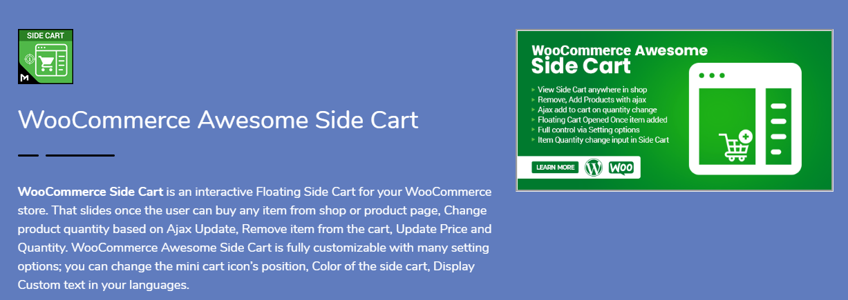
This one’s sleek. Smart. Gets the job done without drama. WooCommerce Side Cart by Motif Creatives gives you a floating side cart that slides in automatically when someone adds a product. Clean animation. No reloads.

Key Features:

  • Ajax cart updates.
  • Remove items without page refresh.
  • Change quantities instantly.
  • Customizable icon position (left/right).
  • Change colors, labels, headings.
  • 100% mobile responsive.
  • Show SKU, price, quantity, subtotal.

You can control every part. From button color to text language. No code needed. Everything’s in the settings panel.

Perfect for those who want control, smooth performance, and full customization.

Bonus: It also supports Ajax “add to cart” on single product pages. Handy.

If you want a modern, all-in-one side cart experience, start here.


2. CartPops – WooCommerce Side Cart

CartPops – WooCommerce Side Cart
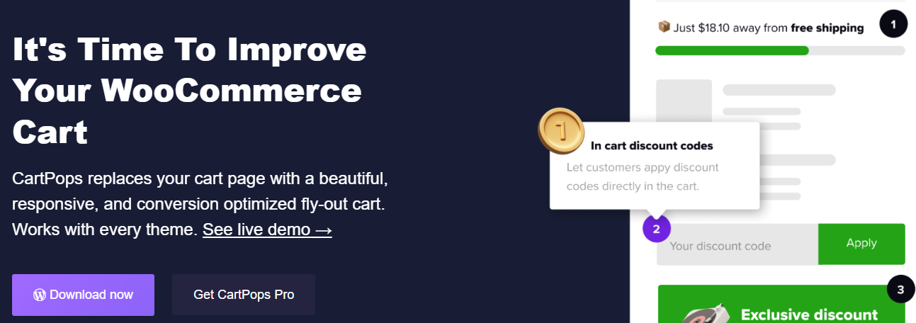
This one goes beyond just showing the cart. It’s a whole checkout booster.

CartPops isn’t just about sliding panels. It’s about behavior-based selling. The popup cart appears with smooth animation—but then offers upsells, related items, or promo codes. Smart.

What You’ll Love:

  • Google Analytics & Meta Pixel support.
  • Exit-intent promotions.
  • Sticky Add-to-Cart bar.
  • Timer-based urgency offers.
  • Highly customizable themes.

CartPops isn’t just functional. It’s persuasive. It knows how to guide users toward checkout, increase average order value, and reduce bounce rates.

Great for: Stores focused on conversions, upsells, and analytics.


3. XT Floating Cart for WooCommerce

XT Floating Cart for WooCommerceWant a cart that just works? No frills? But still feels sharp?

XT Floating Cart gives you a clean cart panel with real-time updates. Everything happens on the fly. No loading screens. Just results.

Highlights:

  • Ajax-based quantity control.
  • Inline coupon application.
  • See item images, names, prices.
  • Fully theme-friendly.
  • Works great on mobile.

No fluff. Just fast performance and ease of use.

It also lets you apply coupons directly in the side cart. That’s a time-saver for repeat buyers.

For those who want performance without too many distractions, this plugin delivers.


4. Side Cart WooCommerce

Side Cart WooCommerceClean. Simple. Effective.

Side Cart WooCommerce focuses on what matters—speed and clarity.

No flashy gimmicks. No complex setup. Just install it and go.

What You Get:

  • Ajax-based updates.
  • Lightweight UI.
  • Cart auto-opens after product is added.
  • Change icon, color, and labels.

The plugin fits into any WooCommerce setup without breaking your theme. And the settings panel is super easy to manage.

If you want basic functionality, this is a solid choice. Especially for new store owners or fast-launch stores.


5. Fly Cart for WooCommerce

Fly Cart for WooCommerce
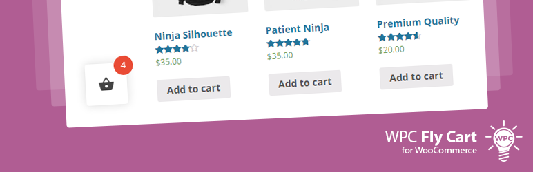
Looking for something fancy? Flashy? A little extra sparkle?

Fly Cart is for you.

What It Does:

  • Animated fly-in side cart.
  • Ajax update and remove.
  • Countdown timers inside the cart.
  • Display cross-sells in cart.
  • Fonts, colors, layout—fully customizable.

Perfect for stores with time-sensitive offers, promos, or impulse-driven buyers.

It adds motion. Energy. Urgency.

Not just a cart. It’s a little show.

Great for fashion stores, gadgets, or deals-based shops.


6. Woo Floating Cart

Woo Floating CartSlick design. Animated entrances. Full styling control.

Woo Floating Cart is made for store owners who love attention to detail.

Standout Features:

  • Choose cart icon shape, size, color.
  • Choose from animation effects.
  • Custom checkout and CTA buttons.
  • Works with all major WooCommerce themes.

The cart floats along every page. Adapts to all screen sizes.

This plugin is less about minimalism and more about expressive UI.

It’s like giving your cart a personality.


7. Mini Ajax Cart for WooCommerce

Mini Ajax Cart for WooCommerce
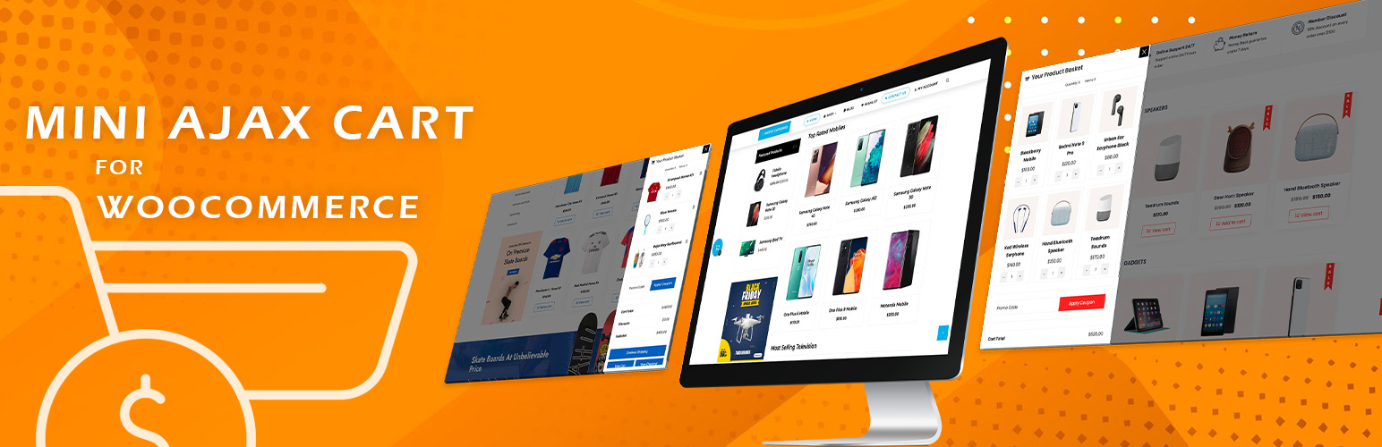
Light. Fast. Minimal.

Mini Ajax Cart is perfect for those who want something small, fast, and effective.

Features:

  • Small side cart panel.
  • Ajax-based update/remove.
  • Mobile sticky cart bar.
  • Show subtotal, total items, product thumbnails.

It’s not as flashy as the others. But it loads fast. And works well with most themes.

Good for mobile-first stores. Or if you just need to show basic cart info fast.

Sometimes, less is more.


What to Look for in a WooCommerce Side Cart Plugin

————————————

Choosing a plugin can feel overwhelming. But here’s how to make it simple:

Ask Yourself:

  • Do I want simple or stylish?
  • Do I need upsell features?
  • Do I care about loading speed?
  • Is mobile support a must?
  • Do I want full control of design?

If you just need fast and light? Go for Side Cart WooCommerce or Mini Ajax Cart.

If you want customizations? Try MotifCreatives or XT Floating Cart.

If you love animations, upsells, and tracking? CartPops is your friend.

Some have free versions. Test them. Mix and match. See what clicks.


How Side Carts Actually Improve UX (and Conversions)

————————————

Still not sure it’s worth the install?

Here’s what a side cart really does:

  • Reduces steps to checkout.
  • Keeps customers engaged.
  • Shows instant product confirmation.
  • Helps fix cart errors fast.
  • Encourages impulse buying.

It’s not just a cart. It’s part of your sales funnel.

A boring cart is forgettable. A slick one? That’s an experience.

And in eCommerce? Experience = conversions.


Final Thoughts

Don’t treat the cart like an afterthought. It’s not just where people review their stuff. It’s the bridge between interest and purchase. If that bridge is slow, confusing, or ugly? People drop off.

So, make it better. Make it faster. Make it smooth.

From the sleek design of the WooCommerce Side Cart plugin to the behavior-driven power of CartPops, you’ve got a lot of great choices in 2025.

Don’t just install a cart.

Install confidence. Simplicity. Clarity. Speed.

Make side carts your secret UX weapon. It’s a small touch that brings big results. Your customers will feel it.

Read More
Sanju August 18, 2025 0 Comments

Why Managing Product Variations is Easier with a Stock Manager Plugin

Especially if your inventory has several sizes, hues, styles, or other features, managing product changes in a WooCommerce store can quickly turn overwhelming. Although WooCommerce provides basic support for variable goods, it lacks the sophisticated stock management capabilities needed to successfully handle them. That’s where a WooCommerce stock management plugin enters.

Designed to simplify inventory updates, these plugins also enable effective insights for changeable products and help to simplify stock management. Here we will discuss why employing a WooCommerce stock management plugin greatly simplifies the handling of product variations.


Understanding WooCommerce product variations

Let us first grasp the challenge before we start the solution. WooCommerce lets you make variable products by combining several characteristics like size and hue. A T-shirt, for instance, could have three colours—Red, Green, and Blue—and three sizes—S, M, and L. Each of these nine distinct variations might have different inventory levels, prices, and SKUs.

Handling these changes manually inside WooCommerce’s standard user interface takes time and is open to mistakes. Individual stock updating takes precious time, there is no single view, and bulk editing is constrained.


Which WooCommerce Stock Manager Plugins are there?

————————————

A WooCommerce stock management tool increases your store’s stock management features. Without having to go to each product page separately, it offers a centralized dashboard where you may see, modify, and change stock amounts for all goods, including variations.

Filtering tools, mass editing capabilities, stock history logs, low stock notifications, and  CSV import/export functionality are among the popular stock manager plugins available. Particularly for businesses with hundreds or thousands of product varieties, these features help inventory management to be much more effective and precise.


Key Benefits of Using a WooCommerce Stock Manager Plugin for Product Variations

————————————

1. Managed Central Inventory

One of the major benefits is the chance to see all product variations in one interface. You can quickly search, filter, and change stock levels, whether you sell ten or 10,000 SKUs, without having to hand-open every product.

For companies with seasonal sales, freshly arriving inventory, or regular stock variations, this is especially useful.


2. Bulk Editing Capabilities

Bulk editing is effortless with a WooCommerce stock manager plugin. You can:

  • Update stock status (in stock, out of stock)
  • Adjust stock volumes
  • change pricing
  • Edit SKUs
  • Handle backorders.

3. Enhanced Filtering Possibilities

Advanced filters offered by stock management plugins help you to reduce list of inventory. By product type, stock status, variance attribute, category, and more, you can filter products.

When you’re seeking to find something, this capability changes everything:

  • variations running short of inventory
  • Goods without a SKU assigned
  • Out-of-stock choices requiring reordering

4. Real-Time Stock Updates

Many plugins interface straight with your WooCommerce store to provide real-time stock updates. The dashboard displays the most recent data as soon as a product is sold or stock is updated. This lowers the possibility of stock mismanagement or overselling.

Real-time precision gets much more crucial if you’re synchronizing inventory over several sales channels like Amazon, eBay, or physical stores.


5. Increased Inventory Visibility and Decision-making

A nice WooCommerce stock manager plugin shows stock information in a neat, tabular form. This visual clarity enables quick detection of trends, including fast-moving goods, underperforming variations, and restock priorities.

Better awareness leads to wise decisions. Having precise stock information at your disposal is very important, whether you’re organizing your next purchase order or getting ready for a sale.


Extra features that simplify life

————————————

CSV Import/Export

Just export your inventory, change it in Excel or Google Sheets, and reload it if you need to update stock in volume. Handling extensive product catalogues calls for this approach.


Alerts for Out of Stock and Low Stock

Get alerts automatically once a change hits a low level; this enables prompt replenishing and helps prevent missed sales.


Access Based on Roles

Some plugins offer multiuser support, enabling warehouse workers or shop owners to update inventory without total administrative access.


Who Needs a Stock Manager Plugin?

————————————

A stock management plugin is necessary if your WooCommerce store offers items with variations, like apparel, electronics, beauty, automotive parts, or personalized goods. Besides streamlining your processes, it increases consumer happiness and inventory accuracy.

Running a shoe store with 50 different styles, each available in five sizes and four colors, for instance, would be unmanageable and unrealistic by hand. An asset manager plugin transforms a tough chore into a doable process.


Final Thoughts

Though a powerful feature in WooCommerce, product variations present a headache in inventory control without the proper tools. A WooCommerce stock manager plugin helps to remove the trouble by providing focused, effective, and precise stock management for all product kinds.

This kind of plugin is a necessity for serious business owners seeking to grow their companies and reduce stock errors, from bulk editing to real-time updates and sophisticated filtering.

Therefore, if you find it difficult to match your product variations, now is the perfect moment to update your workflow with a stock management plugin created especially for WooCommerce.

Read More
Sanju August 8, 2025 0 Comments

Multi-Step Checkout WooCommerce: Simplifying the Buying Journey

One of the most important steps in any e-commerce company is the checkout process. It’s the point at which all the customer’s choice-making leads to one last act: placing the purchase. Still, several WooCommerce shops miss out on possible revenue at this point because of lengthy, confusing, or badly designed checkout pages. Multistep checkout for WooCommerce comes into play here, transforming a large on-page checkout into a simplified, step-by-step process that enhances user experience and raises conversions.

Here, we will examine multistep checkout in WooCommerce, including its concept, advantages, and implementation, and how this minor improvement can greatly simplify the purchasing process.


What is Multi-Step Checkout in WooCommerce?

—————————–

Rather than trying to squeeze all the fields into one page, WooCommerce’s multi-step checkout is designed to break the process down into chunks. This method allows customers to walk through each part of the checkout process without throwing all of the details at once (invoice details, shipping options, payment options, and order summary).

Each stage might comprise:

  • Step 1: Information on invoicing
  • Step 2: Delivery information
  • Step 3: Delivery technique
  • Step 4: Choosing a payment gateway
  • Step 5: Review and confirmation of order

Why should Woo Commerce employ multistep checkout?

—————————–

Here is why integrating a multi-step WooCommerce plugin will significantly boost the performance of your store:

1. Fewer Rates of Cart Abandonment

For internet merchants, a big issue is cart abandonment. The Bayard Institute reports that approximately 70% of customers abandon their carts before completing a transaction. A drawn-out or unclear checkout procedure is one of the main causes. Multi-step checkout simplifies every step, therefore lowering overwhelm and motivating finishing.


2. Upgraded User Experience

Particularly for first-time consumers, a well-organized flow improves usability. Knowing what to expect next and not being inundated with form fields increases the likelihood that customers will keep going with their transaction.


3. Interface appropriate for mobile devices

Mobile users sometimes find difficulties negotiating lengthy, single-page checkouts. The procedure is divided in a multistep design that makes it easier to swallow on smaller screens. This results in greater mobile traffic conversion rates.


4. Promotes Focus and Minimizes Mistakes

Isolating every step lets consumers focus on providing correct data. Particularly with complicated inputs like billing addresses or payment details, this reduces the likelihood of errors.


How the Official WooCommerce Multistep Checkout Plugin Assists

—————————–

Designed to fit effortlessly into your store, WooCommerce’s premium multistep checkout WooCommerce plugin is a premium solution. Designed for performance and user experience, it Let’s explore more closely how this plugin streamlines the shopping process:

1. Configurable Stages

Based on your store’s needs, the plugin lets you split the checkout process into reasonable parts. You can customize the layout by choosing which data shows on each step.


2. Smooth Integration

With the already available WooCommerce checkout fields, it works right out of the box. Installing, enabling, and setting your steps through the plugin options is all that is required; no complicated setup is necessary.


3. Theme Match

Most popular WooCommerce-compatible themes are intended to work with this plugin. This guarantees that your checkout experience keeps the same look and feel without need for custom development.


4. indicators visually

At the top of the checkout page, it features either a step indicator or a progress bar. This lowers friction and increases consumers’ confidence by helping them follow their progress and identify upcoming actions.


5. Enhanced Performance

Designed to load rapidly, the plugin is lightweight and guarantees it won’t slow your checkout page—a frequently expressed worry with other feature-heavy plugins.


Use Case Example: Streamlining Custom Orders

—————————–

Let’s say you run a WooCommerce store selling personalized gift boxes. Your checkout page includes extra fields for:

  • Recipient’s name
  • Gift message
  • Delivery date

With a traditional one-page checkout, all this information sits alongside payment, billing, and shipping fields, cluttering the screen. With the multistep checkout WooCommerce, you can separate gift-related fields into a dedicated step. This keeps everything organized and improves the shopping experience.


How to Implement Multi-Step Checkout in WooCommerce

—————————–

If you’re ready to optimize your WooCommerce store with multi-step checkout, here’s a simple guide:

Step 1: Install the Plugin

Purchase and download the MultiStep Checkout plugin from WooCommerce.com. Then install it via your WordPress dashboard under Plugins > Add New.

Step 2: Configure Step Layout

Once activated, go to WooCommerce > Settings > Multistep Checkout. Here, you can define:

  • The number of steps
  • Which fields appear in each step
    Labels and icons for each step
Step 3: Customize Design

Most themes will style the checkout page automatically. But if you’d like to personalize the design, the plugin provides CSS hooks and layout controls.

Step 4: Test the Flow

Before going live, test the checkout process thoroughly across devices. Ensure each step loads correctly and that no data is lost when navigating between steps.

Imagine you’re running a WooCommerce store that specializes in personalized gift boxes. Your checkout page has extra fields for:

  • Recipient’s name
  • Gift message
  • Delivery date

In a traditional one-page checkout, all this information gets crammed in with payment, billing, and shipping details, making the screen feel cluttered. But with a multistep checkout in WooCommerce, you can neatly separate those gift-related fields into their own step. This not only keeps things organized but also enhances the overall shopping experience.


How to Set Up Multi-Step Checkout in WooCommerce

—————————–

Ready to streamline your WooCommerce store with a multi-step checkout? Here’s a straightforward guide to get you started:

Step 1: Install the Plugin

First, purchase and download the Multistep Checkout plugin from WooCommerce.com. Then, head over to your WordPress dashboard and install it under Plugins > Add New.

Step 2: Configure Step Layout

Once the plugin is activated, navigate to WooCommerce > Settings > MultiStep Checkout. Here, you can customize:

  • The number of steps
  • Which fields show up in each step
  • Labels and icons for each step
Step 3: Customize Design

Most themes will automatically style the checkout page for you. However, if you want to add your personal touch, the plugin offers CSS hooks and layout controls for customization.

Step 4: Test the Flow

Before you launch, make sure to thoroughly test the checkout process on various devices. Check that each step loads properly and that no information is lost when moving between steps.


Tips for Getting the Most Out of Multi-Step Checkout

—————————–

If you want to get the most from your multi-step checkout in WooCommerce, here are some good practices to consider:

  • Reduce the number of steps in the process: Breaking the process up is important, but you don’t want too many steps. Aim for about 3-5 steps at most.
  • Use clear CTAs: Ensure buttons such as “Next Step”, “Continue,” or “Review Order” all clearly make sense and are all in a logical place.
  • Offer guest checkout: Don’t require account registration. Account creation should be optional, at best, and give them the option of social login.
  • Auto-fill fields: Use WooCommerce to auto-fill customer details for you, which saves everyone time on repeat purchases.

  • Display trust signals: Payment security badges and clear refund policies can help ease buyer anxiety at the final step.

Final Thoughts

In today’s fast-paced e-commerce world, every tick is precious, just like every click. A messy or confusing checkout process can unravel all the hard work you’ve done to get the customer to that point. Thankfully, multi-step checkout WooCommerce plugins offer a viable, easy-to-use solution that can help reduce cart abandonment, improve sales, and create a better shopping experience.
By choosing to implement the Multistep Checkout WooCommerce plugin, you are doing more than beautifying your site; you’re also improving its productivity, usability, and customers’ confidence in you. Ultimately, whether selling digital downloads, physical goods, or custom orders, the WooCommerce Multistep Checkout plugin will provide all customers with a less confusing checkout experience.

Read More
Sanju August 6, 2025 0 Comments

Dropdown or Radio Buttons: Which Should You Use for Product Variations in WooCommerce?

Not every decision in eCommerce screams important, but some of the smaller ones, like how your customers choose a size or color, can quietly affect your sales. If you are selling products that have variability, you are likely to be stuck with default dropdown menus. They are simple, familiar, and get the job done. 

But are they the best option?

Many store owners have started shifting toward radio buttons and visual swatches. It’s not just a design choice. It’s about how people interact with your products. The easier and faster it is for shoppers to make a choice, the more likely they are to buy.

And that’s where things get interesting.

In this article, I’ll walk through the pros and cons of both dropdowns and radio buttons. We’ll look at where each makes sense, and why tools like WooCommerce Variation Swatches might help you bridge the gap between boring and brilliant.


What Are You Actually Selling?

—————————-

Let’s pause before we jump into the tech stuff.

If your store products come in various forms. If it could be jacket in 4 sizes and multiple colors, then you’re offering variations.  Each variation is a different version of same product. Customers will pick the right one before they can check out.

WooCommerce has a built-in way of handling this, and it’s fine. You set up attributes like size or color, and your customer selects from a drop-down list. Job done.

But when you’re selling something visual like fashion, cosmetics, or furniture, does a dropdown labeled “Sky Blue” or Lime” really show what you’re offering?

That’s the big question here.


Why Dropdowns Still Exist And Why They’re Not Always Bad

—————————-

Let’s be fair. Dropdowns have been around forever, and for good reason.

They’re clean.

If your product has a ton of options, say, 25 sizes or 50 shades, putting all of that on display can make a product page look like a jumbled mess. Dropdowns keep it neat and contained.


They’re universal.

Everyone knows how to use a dropdown. Even if someone’s shopping on a dusty old laptop from 2010, the dropdown will work just fine.


They work out of the box.

WooCommerce doesn’t require any extra plugins or custom work to set them up. You pick your attributes, add your variations, and you’re good to go.

So, yes, dropdowns are functional. But if something works doesn’t mean it’s perfect.


Where Dropdowns Start to Fall Short

Here’s the thing: we are living in a world of rapid feedback and visual cues. Apps like Pinterest or  Instagram. Customers don’t want to read labels to understand visuals; they only see what they are getting.

Problem 1: They Hide Options

If you bury your product variations in dropdowns, some customers may not even notice all the available choices. Out of sight, out of mind. And out of cart.

Problem 2: They Slow Things Down

Clicking, opening, scrolling, selecting. Multiply that by every variation a customer has to choose, and it starts to feel like work.

Problem 3: No Visual Guidance

When you’re selling something where appearance matters, a dropdown that says coral or midnight isn’t as helpful as a color swatch.


Radio Buttons and Swatches: Making It Visual

Radio buttons are the old-school HTML way of showing multiple options at once. But in the WooCommerce world, they’ve evolved big time.

Thanks to plugins like WooCommerce Variation Swatches, store owners can now show:

  • Color circles
  • Image thumbnails
  • Text buttons (like S, M, L, XL)
  • Even custom icons

And here’s the best part: all of it is clickable, easy to scan, and much more engaging than dropdowns.

Let’s be honest, people don’t want to “select” a color from a text menu. They want to see the color. They want to click the one that speaks to them.

That’s why swatches are winning.


But It’s Not Always That Simple

Okay, before you go installing swatches everywhere, there are a few caveats.

1. They take up space.

If you are offering 20 colors, this means you have 20 swatches on the store page. You will need to think about layout user interface to make sure it looks good.

2. You’ll need a plugin.

WooCommerce doesn’t offer this out of the box. So you’ll need to install something like the WooCommerce Variation Swatches plugin. It’s not hard, but it’s one more thing to manage.

3. You’ll need to prep your visuals.

No point in showing image swatches if the images are low quality or inconsistent. You’ll need to take time to prep your icons or color files so they look clean.


Let’s Compare in Real-World Terms

Let’s walk through a basic example:

You sell: Hoodies
  • You offer five color choices: black, olive green, wine red, dusty pink, and navy blue.
  • For sizes, customers can pick from small, medium, large, or extra-large.

Using dropdowns:

Your customer selects color → chooses from a list. Then select size → another list. Not painful, but not exciting either.

Using swatches:

All colors are visible as little color bubbles. Sizes show up as square buttons. No clicks to open anything. The customer clicks on olive,  image updates. They click large, and they’re done. fast, clear, satisfying.


When Dropdowns Might Still Be Better

Don’t feel pressured to use swatches for everything. Sometimes, a good old dropdown makes more sense.

  • Digital products with licenses (Basic, Pro, Enterprise)? A dropdown is cleaner.
  • Items with lots of variations (over 15)? Swatches can become cluttered fast.
  • Need quick setup and no extra plugins? Stick with the default setup and move on.

When Swatches Are the Smarter Move

If your store sells anything where color, texture, or visual style matters, switching to swatches is a smart bet.

  • Fashion
  • Home decor
  • Beauty products
  • Jewelry
  • Stationery

These are all areas where showing is better than telling.

And let’s not forget mobile shoppers. Tapping a big color swatch is way easier than dealing with dropdown menus on a small screen.


Some Quick Tips Before You Switch

If you are planning to switch from dropdowns to swatches, keep some important things in mind.

  1. Don’t go overboard.
    Don’t load too many swatches on same page. A clean and well-structured layout helps customers to find what they want without feeling overwhelmed.
  2. Make swatches readable.
    Use tooltips or labels. A swatch with no explanation can be confusing.
  3. Check mobile views: Before wrapping up your changes, always ensure to test the layout appearance on mobile devices. Most of visitors like to visit stores or websites through their phones. For this, everything runs smoothly.
  4. Stay consistent: Use the same style of swatches across your store. This keeps the design layout easy to use and professional.


Final Thoughts: What Makes Sense for Your Store?

If your product options aren’t very visual, like licenses, file formats, or long size lists, then dropdowns probably do the trick. They are easy and instantly set up and keep things simple.

If the appearance of your product matters, like its color, texture, or pattern.  It’s better to show those options right away. Letting people see and choose visually makes the decision process feel more natural and less like guesswork.

You don’t need to rebuild your entire store to improve how customers choose product options. A plugin like WooCommerce Variation Swatches can store attractive and easy-to-use. Though it takes time to set but, after this it will make natural browsing for everyone. And buyers can quickly make sense of their choices. They are more likely to follow through with a purchase.

Read More
Sanju August 4, 2025 0 Comments

Future of WooCommerce User Dashboards: AI-Personalization and Smart Navigation

When we talk about WooCommerce, the main focus is always on the product’s web pages, funnels for checkout, as well as payment methods. However, once a sale has been made, where do buyers go? They go to the section of the site where most store owners do not spend enough time contemplating their WooCommerce My Account Page. This is where customers who return look up their orders, download files, control address information, monitor points, and more.

With more stores shifting to providing returning customers with more options and more options for account management, the default page doesn’t suffice anymore. It’s basic. It’s effective, yes. But it doesn’t do much else. In the present, as AI devices are getting more prevalent and stores are learning about how customers use their dashboards, the future is beginning to appear different. We’re moving into a new era in which AI-based personalization and smart navigation will be standard and not an optional extra.

So let’s look at the future of shopping. It’s not just about the technology, however, but what it actually will mean for admins, users, and store owners who are trying to improve the shopping experience.


Why the Account Dashboard Matters More Than You Think

———————————–

The majority of people log on to their accounts to fulfill a purpose. It’s more than just browsing. They’re trying to discover something, fix the issue, or take up where they had left off. This moment of intent is powerful and important. If your dashboard gets in the way or gets in their way, it’s an opportunity lost.

The My Account page on WooCommerce usually ends up being an uninteresting list of hyperlinks. Orders, addresses, and account details. That’s it. It doesn’t tell anything about what users are interested in. It doesn’t offer suggestions or make things easier. In 2025, this kind of dashboard will not work anymore.

Customers expect smart interfaces. This isn’t because they’re spoilt and spoiled, but because it will save time. They’re looking to find out what’s important to them. If they’ve made a recent order, perhaps they’d like to follow the order. If you downloaded a file on the last day and would not like to comb through menus to locate the file again. This is where the concept of personalized navigation and personalization comes into play.


What AI-Personalization Can Do

Let’s make this process as simple as we possibly can. AI doesn’t mean that your dashboard is talking to users with robot voices or offering long-winded recommendations. It’s not an issue to be discussed.

AI personalization is the process of paying close attention to the habits and behaviors of the user. It then alters things the user is exposed to on account of the information it has gathered. If a user constantly clicks on the “Downloads” tab, maybe it will appear first the next time they sign in. If they made an order late last night, the dashboard could show that order at the top with no click needed.

Plugins that let you personalize the WooCommerce My Account Page are already beginning to accommodate this. Some let you display or hide tabs according to the user’s role. Some let you display banners that show only specific pages or actions. In addition, it’s not just about visibility but timing as well.

Imagine a user who has accrued reward points. If they log in the next session, a pop-up displays to inform users that “You’ve earned 120 points.. Here’s how you can use the items.” It’s not a magical event. It’s smart logic developed with a unique approach within the brain. It’s effective.


Smart Navigation Is About Doing, Not Searching

———————————–

Many retailers believe they’re helping by introducing more options on the dashboard. However, the more options you include, the more difficult it will be to find something. People don’t wish to comb through 12 tabs in order to find “Wishlist” or “License Keys.” They’d rather go in and take what they’ve come to do, and then get out.

Smart navigation is the process of making things easier. This is not done by removing options but by better organizing them. This could involve putting related items into sections that can be collapsed. It could also mean giving priority to the tabs most used and hiding tabs that people don’t click. This also implies the ability to let users search for items by their behavior.

Perhaps your shop supports both wholesale and retail buyers. Why should you show the identical options to all of them? By setting up a dashboard with a role-based structure, it’s possible to show one layout to regular buyers and another one to wholesale accounts. Reduced clutter. More value.

Certain plugins already allow you to assign roles to users on each endpoint. You can select which tabs display for what roles, and even which widgets or banners are displayed for them. The dashboard appears to be designed specifically for the user, not merely a template.


AI Can Recommend Content, Not Just Products

———————————–

Let’s not forget that customers don’t just come back to reorder. Sometimes they need support. Or guides. Or a license renewal. The dashboard is the perfect place to recommend these things, especially if the customer just completed a related action.

Say someone just bought a camera. On their next visit, the dashboard could show a banner linking to setup tutorials. Or maybe they downloaded a file last week, and they could see a link to the updated version. These small things make the account dashboard feel alive. Like it’s working in the background to help them.

AI recommendations inside the WooCommerce My Account Page aren’t just for upselling. They’re for building a smarter connection. You’re showing that your store is aware of the user’s history and that you’ve got something relevant to show them. That could be a product, a guide, or a form.


Design Still Matters: Layout and Interaction

———————————–

The many advanced features you can avail do not make sense if your dashboard appears like something from an Excel worksheet. The design is the primary element that determines the perception people get from using dashboards. It’s not just about looks but also the layout clarity, clarity, and layout, as in addition to the capacity to adapt.

Modern dashboard plugins provide an option to change the layout. Users can select which menus they would like to display. The menus will be displayed either on the left, right side, or at the top. You can decide what size banners to use. You can alter the dimensions of the icons, as well as how far apart labels are, as well as how big the font is. The aim is to make the dashboard look clean and simple to comprehend.

It is able to display information in various ways. Certain dashboards show information from users in tables. Certain dashboards use cards that have icons, as well as tiny amounts of text. Users are also able to upload avatars and alter the design of the dashboards they choose to use.

Banners are a major component within the previous. They’re not used only for decoration. The right banners can guide users to perform tasks that require a lot of time, for example, such as changing the passwords for account holders, downloading fresh files, or signing up for deals. Banners are able to be accessible only to those with specific roles, or connect them to specific areas, and track the frequency at which they click.


What’s Coming Next for Dashboard Features

———————————–

Looking ahead, there’s one clear direction: more control for the store owner, and a more intuitive experience for the customer.

We’re going to see more plugins and dashboard tools that let you create dynamic dashboards. Not just static links and pages, but dashboards that update based on data. Think activity summaries. Loyalty statuses. Account alerts. These things will appear automatically based on customer behavior.

And integrations will go deeper, too. Tracking tools like Google Tag Manager are already being used to monitor what users click inside dashboards. Store owners can see what tabs are popular, what banners get ignored, and what content gets viewed. This data can then be used to rebuild the dashboard for better results.

Eventually, we might even see dashboards that completely change based on season, product category, or account history. For example, a dashboard in December might highlight gift orders. In January, it might show the order history from the holidays. And if a customer hasn’t logged in for 90 days, the dashboard might show a special offer or reactivation message.


Wrapping Up

The WooCommerce My Account Page is no longer just a site to view the status of your previous orders. It’s becoming an essential hub. A custom control panel that is tailored to every customer. The more efficient the panel is, the more likely they will be to return to your store.

Artificial Intelligence-based Personalization and Smart Navigation aren’t just trendy. They’re intelligent next steps. They allow customers to save time, discover the information they require, and feel as if they’re getting something and not just being processed.

If you’re still using your default dashboard, now is the time to think about changing this. There is no need for custom code to build a smart dashboard. All you need is the proper tools, a small amount of setup, and an eye on what your customers do after purchasing.

The post-purchase experience is where loyalty truly begins. Your account dashboard is where you will experience that feeling every time.

Read More
Sanju July 27, 2025 0 Comments

How the WooCommerce Size Chart Guide Increases Customer Satisfaction

Online shoppers often hesitate at checkout when they aren’t sure which size will fit. Lack of reliable sizing information leads to abandoned carts, frustrated emails, and extra work handling returns. The WooCommerce Size Chart Guide steps in here: it gives clear, easy‑to‑access measurements that match each product’s fit. By using the WooCommerce size chart on your product pages, you build shopper confidence right from the start, cutting doubts and turning clicks into happy customers.


The Challenge of Finding the Right Fit

——————————

Many brands have their own size labels. What’s a “Medium” in one label might be “Large” elsewhere. That mismatch causes guesswork:

  • Customers buy multiple sizes “just to be safe”
  • They return the one that doesn’t fit, raising your return costs
  • Shoppers get annoyed by sizing surprises and may shop elsewhere

Without a WooCommerce size chart, visitors often abandon carts or leave frustrated reviews. They lack clarity on bust, waist, hip, or length metrics tied to your specific products.


How the Size Chart Guide Works 

——————————

The guide gives store owners a flexible plugin to build and display tailored charts. Here’s how it lays out:

Create and Assign Multiple Charts

  • Unlimited charts: Make as many guides as you need for different clothing lines or brands.
  • Product and category rules: Assign a chart to individual items or entire collections.

Display Options That Fit Your Theme

  • Tabs: Embed a chart under a “Size Guide” tab on the product page.
  • Popups: Show a button that opens a modal overlay—no page reload needed.
  • Shortcodes: Insert the chart anywhere you like (sidebars, footers, custom blocks).

Easy Custom Styling

  • Colors and fonts: Match your brand’s palette for buttons, headers, and table text.
  • Animations: Choose fade, slide, or zoom effects to keep the experience lively.
  • Image uploads: If you prefer a designed chart graphic, just upload it and skip manual formatting.

Boosting Confidence at Checkout

——————————

When a shopper sees precise measurements right beside “Add to Cart,” doubts melt away. The WooCommerce size chart:

  1. Provides clarity: Exact chest, waist, or inseam numbers eliminate guesswork.
  2. Speaks buyer language: Clear labels like “Hip circumference (cm/in)” make data easy to understand.
  3. Keeps shoppers on page: Popups prevent shoppers from leaving the product page, keeping momentum for customers.

As customers feel sure about their choice, they move through checkout faster, and you will see fewer abandoned carts.


Crafting Custom Size Charts for Niche Products

——————————

Every special item needs its own size guide. Picture hats, gloves, or corsets; each calls for different numbers. With the WooCommerce size chart plugin, you can whip up a chart for any product line. First, jot down the main measures: head size for hats, glove length from wrist to fingertip, or under-bust and waist for corsets.

Then, bunch similar products into one table. For instance, make one sheet for girls hats and another for guys. Link each sheet to the right category or item. That way, shoppers see only the guide meant for them.

Keep the notes simple and friendly. Show every number in inches and centimeters. Add a quick tip-say, Measure just above your eyebrows, they nail it the first time. By building these tight guides, you turn guessing into easy steps. Your niche fans will return less and buy again more.


Visual Guides: Using Images

——————————

Tables can share facts, but a well-timed image speaks louder. A single picture shows exactly where you mean, look here for the chest, there for the waist or inseam. Whip up a quick sketch with arrows and labels, then drop that graphic into your WooCommerce size-chart block.

Keep lines bold and letters large. Skip busy backgrounds-your chart must stay crisp, whether shoppers use a phone or a laptop. No fancy software needed; plugins let anyone drag, drop, and label in five minutes.

When your image is done, pick the Image option and upload. Place it in a tab or popup so customers can click it and look around without leaving the page. A clean visual cuts confusion and lets buyers nail the right size with one quick glance.


Cutting Returns and Lowering Support Tickets

——————————

Exchanges damage profits and jam the support queue. A solid WooCommerce size chart helps in three ways:

  • First, it slashes return rates because buyers who nail the right fit the first time rarely send items back.
  • Second, cutting happens when fewer shoppers email, What size should I buy? so that question frees up hours for your team.
  • Third, satisfied customers post more five-star reviews because the only surprise is how well the item fits.

Fewer mix-ups also lighten the warehouse load and help fulfillment teams ship orders correctly on the first pass.


Building Trust and Loyalty

——————————

Trust grows when you tackle a customer’s pain point head-on. A sizing chart lends that credibility by letting you:

  • Show expertise with a clear guide that proves you know clothes and what shoppers really need.
  • Deliver honesty from the start because no measurement is hidden every size sits right there in plain talk.
  • Encourage repeat buys as shoppers come back to brands that make figuring out fit feel almost effortless.

With that extra layer of care, a one-time buyer can quickly turn into a loyal fan willing to spread the word.


Best Practices for Your WooCommerce Size Chart Guide

——————————

To get the most from your product size charts plugin for WooCommerce, keep these basics in mind:

  1. Keep charts up to date by revisiting each guide every time a new style lands on the floor.
  2. List both metric and imperial numbers to cover US buyers and shoppers from around the globe.
  3. Highlight key spots by bolding waist, chest, and other crucial measures so they pop for anyone scanning.
  4. Run a mobile test: Pop­ups and tabs should look sharp on phones and tablets.
  5. Add a link in promo e­mails: Remind shoppers about the size guide so they feel sure before clicking through.

Each step makes customers feel informed and ready to buy. You can also read about how to add WooCommerce size chart to your store in more detail.


Measuring Success

——————————

Keep an eye on these numbers to see how the WooCommerce size chart is doing:

  • Return rate change: See how returns Before and After the chart compare.
  • Cart abandonment rate: Watch for fewer customers dropping off on product pages.
  • Support ticket volume: Count size questions that come in before and after the chart goes live.
  • Conversion uplift: Track sales growth on items that show the chart.

Review these figures regularly so you can tweak the chart and make shoppers even happier.


Conclusion

Add a simple WooCommerce size chart to your shop, and you tackle sizing worries right away, cut down returns, and boost sales. When shoppers find clear measurements in a handy tab, they feel sure about their choice and complete the purchase. That confidence usually shows up as glowing reviews, repeat visitors, and less money spent on handling returns. Implement the guide today, monitor your key metrics, and enjoy a smoother, more satisfying shopping experience for everyone.


Frequently Asked Questions

What is a WooCommerce size chart?

A WooCommerce size chart is a handy pop-up or table that shows customers important body measurements, waist, and hip-so they can pick the right size before buying.

How do I add a size chart to my WooCommerce store?

First, install the free Size Chart Guide plugin, then use the dashboard to build a chart, pick how it shows up-a tab, a popup, or a shortcode and finally link it to specific products or whole categories.

Can I upload my own size chart image?

Definitely. The plugin lets you upload a ready-made image, so you avoid the time-consuming work of setting up columns and rows by hand.

Will a size chart reduce returns?

For sure. When shoppers see clear sizing details, they guess less and choose the right size the first time, which cuts returns and costly exchanges.

How do I track the impact of my size chart?

Just watch return rates, cart drop-offs, help tickets, and sales numbers on pages that show the chart; those changes show you how well the plugin is working.

Read More
Sanju July 23, 2025 0 Comments