Over 3.6 billion people, or 49% of the human population, use social media worldwide, and this number only continues to grow.
With this trend, social media has become a vital and almost indispensable part of marketing.
Advancement in technology and the internet has led social media to become a powerful platform used by businesses to reach their audiences and promote their brand, products, and services. If you’re not adequately tapping into the potential market composed of billions of people scrolling through social media apps for countless hours, then you might be doing something wrong.
Nowadays, having a successful business depends on a robust online presence and customer engagement. But it’s not all that easy to build a reputation online. With 81% of small and medium-sized businesses using social media today, you need to get creative in capturing people’s attention.
So how do you get your target audience’s attention on social media? Simple…give them something nice to look at.
Why is Graphics Important When Starting a Social Media Campaign?
“A picture is worth a thousand words” – this old idiom dates back to the early 20th century, but it still holds, especially now in the age of the internet and social media.
People are highly visual creatures – our brains are hardwired to absorb visual information faster and more efficiently than plain text. It’s no surprise that the trend towards visual social media continues to go up.
Every effective social marketing campaign requires good graphics. Having visuals on social media not only increases brand awareness but also encourages user engagement. Posting an image along with your captions can increase the number of clicks, shares, comments, retweets, or reposts up to 3 times – this is why picking the right graphic is essential.
When you create a brand, it is crucial to stand out. Graphic design alone does not build a brand, but it will make you recognizable.
Social media graphic design is not merely a nice image with sprinkles of text on the sides. It is more complicated than that. Your design must be reflective of the information you want to convey. To do that, you must use certain font styles, color palettes, or layouts; otherwise, your design might not get the attention it deserves.
So how do you create social media graphic designs that will ensure better engagement? We’ve got ten tips to help make your designs stand out and leave lasting impressions.
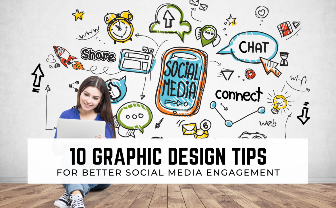
10 Innovative Graphic Design Tips For Better Social Media Engagement
There are a few things to consider when creating impactful and striking graphic designs. Here, we give you ten innovative graphic design tips to help you make better, more engaging visuals for your social media posts.
Let’s begin!
1. Set your goal and work towards it
Before you even select your canvas, pick your colors, or compose your caption, the first thing you need to do is to set your goal.
Goal setting is the most critical step in the entire design process. It is where you envision where you want to be and how you want your audience to perceive your content.
Consider your goal as your north star – the basis for creating all your designs for your content. All ideas you might have and their execution must always reflect your goal.
Having a goal will aid your design process and allow you to deliver your message more effectively.
So how do you determine your goal? Start by answering the following questions:
- Whose attention do I want to capture?
- – What social media platforms are they using?
- – What devices do they usually use?
- What message do I want to communicate to my audience through my social media graphic?
- What is my purpose for posting content?
- What do I want users to do after seeing my graphic?
- Do I want more user engagement?
- Do I want to increase my sales?
Basically, answering the who, what, where, when, how questions before jumping the gun will give your creative process organization and structure.
Remember to keep your goal narrow rather than overbroad. Having too many goals can impact your design negatively as it can lead to an overwhelming graphic.
Now that we have the first tip out of the way, let’s move on to visuals!
2. Simplicity is the ultimate sophistication
In the world of graphic design, less is more. This is why you must always try to keep your graphics as simple as possible.
Social media graphics require you to work with a relatively smaller canvas. With such limited space, overcrowding can quickly be a problem.
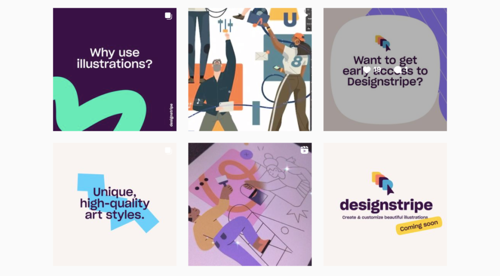
Image Source: Example of Simplicity in Design from Designstripe.com – illustration creator tool.
To avoid overpopulating your canvas with elements, remember to use large, scroll-stopping illustrations, minimal texts, pleasing yet straightforward fonts, and fewer but contrasting colors to keep the visuals cohesive. Focus on the aesthetic appeal of the design and the message you want to convey to your audience.
Do not be afraid to leave white spaces in your canvas. It might seem daunting, but if done right, this technique can enhance the design and pull your viewers’ attention to the exact message you’re trying to flaunt.
Place every element with careful intent. Your hard work will only go to waste if you fail to make your message clear to the audience.
3. Respect the Hierarchy
People are naturally drawn to BIG, BOLD FONTS. So if you want to draw attention within milliseconds, create a visual hierarchy.
Visual hierarchy is the use of color, typography, type size, and strategic positioning to emphasize more important information on a page.
To effectively highlight significant messages in your post, texts of higher importance must be made dramatically bigger while other information can be added in smaller fonts.
Compel your audience to take action by keeping their focus on what’s important. Think you can do that? Then START NOW.
4. No beauty without color
Around 92.6% of people believe that color/design is the number one factor influencing their decision to purchase something. This is the reason why color is a vital element in graphic design.
Color has the effect of evoking certain emotions, feelings, senses, and even memories. Social media engagement is almost guaranteed once you’ve learned how to integrate the psychology behind color into your graphic effectively.
Social media is a busy place, with millions of people competing for a split-second of attention. One way to get a slice of the pie is to have a good color theme.
Finding the most suitable color scheme is crucial to the success of a graphic design. To make a captivating design, you must pull your audience’s attention through color alone. But how do you do that?
Image Source: Nazmul Sarker Siyam
Make sure that your colors reflect the goal you’ve initially set and will create the reaction you want to get from your audience. Your color palette needs to be consistent with your niche and the message you want to deliver.
Be mindful of contrast, balance, and hues and how their pairings can influence viewer perception. Once you’ve picked out your color scheme, take note of the hex codes. This will help you in ensuring consistency in your subsequent posts. Keep in mind that consistency establishes your brand’s identity in the long run.
Keep abreast of the latest color trends. Ride with the competition by knowing what’s “in” in the industry. This will help you select colors that will best resonate with your target audience.
Finally, choose colors that you are comfortable with but don’t be afraid to bend the rules. Once you’re familiar with the rules – color wheel, contrast, balance, etc., go ahead and play around! There is no room for playing it safe when it comes to social media graphics. Sometimes the best way to get engagement is to go out of the box.
5. TXT
When creating social media graphic designs, you want to limit your text to avoid overcrowding.
While text plays an essential role in communicating your brand’s message, too much text can make your design look busy – this is not good as it might overwhelm your audience.
A good rule of thumb for social media is to limit text to one to two liners. Keeping your text short and sweet while finding the right font size and color will improve readability and increase the chances of your content being consumed on mobile phones.
Pairing a light-colored font with a dark background and vice versa is an ideal strategy.
6. Make it legible
A cardinal tip for graphic designing is to make sure that your text and content are readable.
No person would want to squint their eyes or decipher cryptic codes to get your message. While fancy typefaces are pretty to look at, sometimes it is unnecessary and might only lessen legibility.
If you want user engagement, make sure that your text is easy to read. Please don’t overdo it. You want your audience to read your message through easily. You can do this by ensuring you have a good background, decent colors, classy fonts, and a carefully thought-out typeface and overall texture.
Play around with brightness and contrast so your message is easier to read without exerting too much effort.
7. Typography
Typography is an art in itself. Choosing the perfect set of fonts that best reflect your brand’s personality can bring your social media image to life.
Like color, typography sets mood, tone, and ambiance. When choosing the right font/s, think about the desired tone you want to depict through your graphic.

Image Source: Focus Lab
Usually, the font/s you use can either make or break your design. Make sure that you maintain the readability and appeal of your design by limiting the number of typefaces to a maximum of three, selecting the appropriate font size to match your canvas, and carefully aligning fonts with your images. The fonts you choose must tie up seamlessly with the overall aesthetic of your design.
Know which fonts match the type of industry you’re designing for. Don’t shy away from newer fonts; just like with color, take the opportunity to experiment with different fonts.
8. Crank up the contrast
Give your design the extra “pop” it needs by cranking up the contrast.
Contrasting provides a clear line between elements, making one emerge above others. Using contrast effectively is an excellent way to make your social media graphic design stand out.
Note, however, that you need to find the right balance as too much or too little contrast can leave your design looking either too “flat” or too “cluttered.”
One of the ways to effectively implement contrast into your design is through the use of colors; use light-colored background while adding text in the darker color spectrum and vice versa.
Another way is through the use of shapes. Symmetrical shapes tend to stand out when placed alongside asymmetrical figures.
Lastly, add contrast with sizes. Make certain aspects of your design larger and bolder, whole mixing in smaller and more subtle elements.
Contrasting elements add a little “oomph” to your design and will help your brand stand out. Just be careful not to overdo it!
9. Consistency is key
Consistency is the fundamental building block of social media graphic design as it helps establish and strengthen your brand.
Lock in your desired elements such as fonts, colors, typeface, and illustrations, and use them repetitively in your designs to maintain consistency. Remember that everything must coincide and produce a distinctive and immediately recognizable look.
If your graphics look and feel related, it will help your audience form a clear association of your brand in their minds.
10. Keep innovating
The world of social media moves at a swift pace, so be sure your graphic designs can keep up with the changing times.
Always study the market, identify user behaviors, and look at the latest trends. What may get people’s attention now might not work in a month.
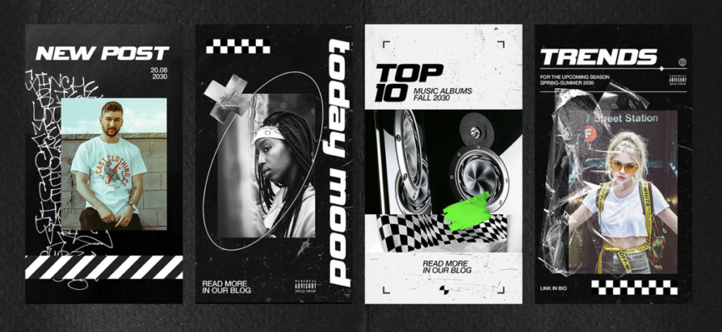
Image Source: Soft Crafts
An exceptional strategy to find your latest graphic inspiration is to take time to browse through social media accounts of the big players in your industry, such as successful businesses or up-and-coming social media influencers. Adopt elements you like or innovate from there.
Don’t be afraid to do the research. Venture onto new platforms and keep on evolving.
Speaking of innovations, revamp your graphic designing experience by integrating text-to-image API in your app or software.
Text-to-image API uses AI technology to create images based on your caption or text description. Looking for the best images that fit your aesthetic, niche, and design goal cannot get any easier with this revolutionary image-generation tool.
It’s your time to shine!
Now that you’re equipped with our ten tips and tricks to make more engaging social media graphics, get ready to make scroll-stopping, awe-inspiring, and share-worthy content!
Remember to always strive to come up with new and exciting design ideas tailored to your target audience. At the end of the day, authentic designs that show personality are always appreciated!