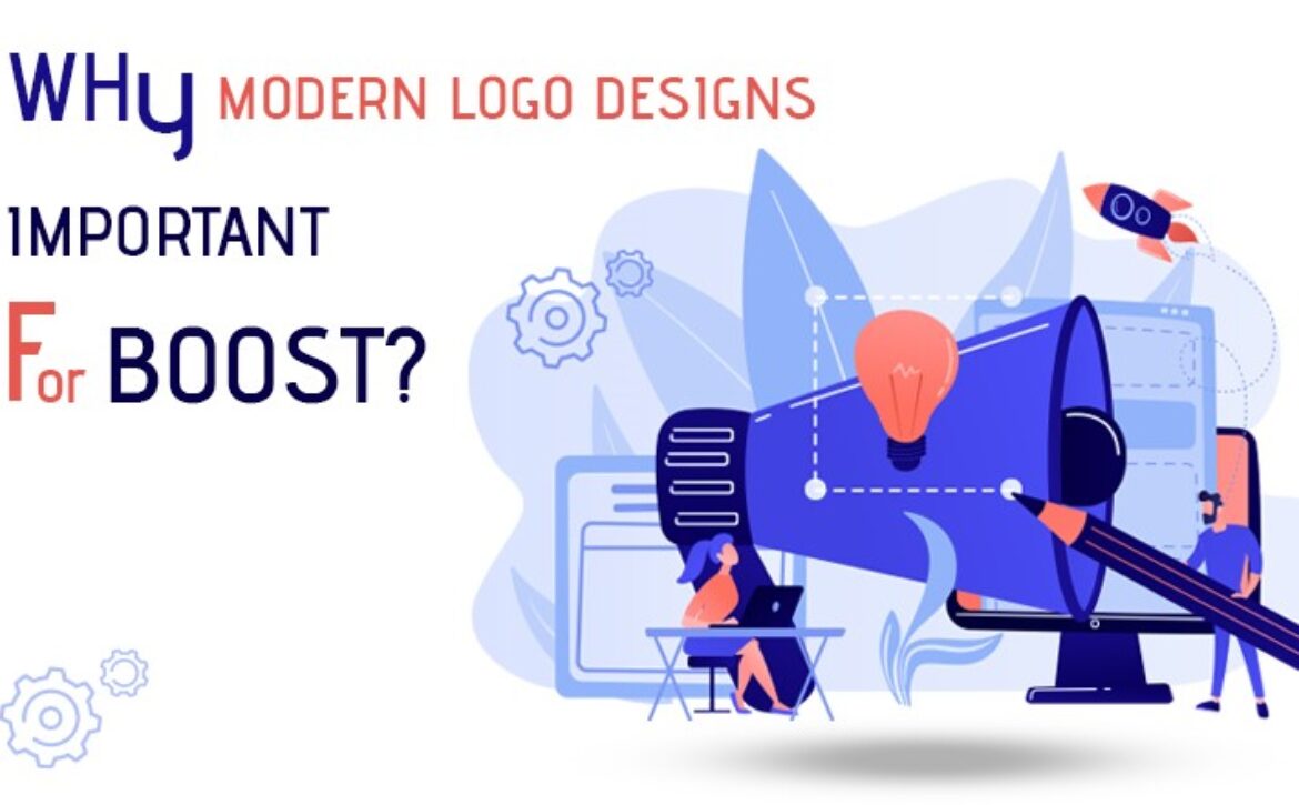
Top Logo Design Trends in 2025: How to Future-Proof Your Brand
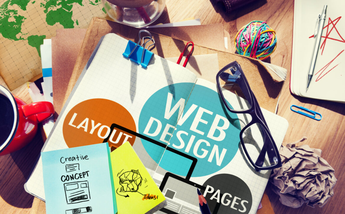
A strong logo is at the heart of every successful brand. As design trends evolve, businesses must adapt to stay relevant and competitive. In 2025, brands must pay close attention to emerging logo design trends to maintain a strong visual identity, connect with modern audiences, and future-proof their presence in a rapidly changing marketplace.
In this article, we’ll explore:
✔ The latest logo design trends brands must know in 2025
✔ Actionable branding tips to stay ahead
✔ Insights into color palettes, typography, and visual styles
✔ Real-world examples of brands adopting new trends successfully
1. Minimalism with a Purpose
——————————–
Minimalist logos are not new, but in 2025, minimalism goes beyond just “simple.” The focus is on intentional simplicity—each element must serve a clear purpose. Logos are being stripped down to their core to ensure maximum clarity across digital and physical platforms.
Tip:
Use clean lines, limited colors, and strategic spacing. Think functionality first.
Example:
Mastercard’s 2025 refresh showcases refined simplicity while maintaining brand recognition.
2. Adaptive and Responsive Logos
——————————–
With countless devices and screen sizes today, logos need to be flexible. In 2025, brands are creating adaptive logos that transform depending on the platform—simplified for mobile, detailed for desktop, bold for billboards.
Tip:
Design multiple logo versions (full, icon, monogram) to maintain brand integrity everywhere.
Example:
Spotify’s evolving logo subtly adjusts for app icons, car displays, and smart TVs without losing its core identity.
3. Bold, Vibrant Color Schemes
——————————–
2025 will continue the move away from muted palettes toward bold, energetic colors that pop, especially on screens. Brands are using rich gradients, neon accents, and dual-tone contrasts to grab attention instantly.
Tip:
Choose a vibrant palette that reflects your brand’s personality but maintains legibility and consistency.
Example:
Instagram gradient logo led the way, and new brands like Duo lingo and Discord are amplifying this trend even further.
4. Handcrafted and Custom Typography
——————————–
Brands are moving away from generic fonts and embracing custom typography that reflects their unique voice. Hand-drawn letters, quirky serifs, and personality-filled sans-serifs are in high demand.
Tip:
Invest in custom typefaces or work with a typographer to create a logo that’s truly yours.
Example:
Mail chimp’s playful, handwritten logo perfectly captures its approachable and fun brand tone.
5. Emphasis on Storytelling through Symbols
——————————–
A logo is more than a pretty graphic—it tells a story. In 2025, brands are embedding subtle narratives into their logos, using hidden symbols, meaningful shapes, and clever negative space.
Tip:
Incorporate meaningful elements that reflect your brand story without cluttering the design.
Example:
FedEx’s hidden arrow between the “E” and “x” is a classic, and newer brands like Airbnb use symbolism to convey community and belonging.
6. Nostalgic Retro Revival
——————————–
Brands are tapping into nostalgia by reviving vintage design styles with a modern twist. Think retro fonts, muted color palettes, and classic motifs reimagined for today’s audiences.
Tip:
Blend retro elements with modern minimalism to create a fresh yet familiar brand identity.
Example:
Burger King’s 2021 logo rebrand leaned heavily into 70s-inspired aesthetics—and the trend is growing stronger in 2025.
7. Motion and Dynamic Logos
——————————–
Static logos are giving way to dynamic, animated logos, especially for digital platforms. A simple spin, color change, or fluid transformation adds excitement and captures attention.
Tip:
Create subtle logo animations for website headers, social media posts, and digital ads.
Example:
Google’s animated logo transitions during searches make the brand feel more alive and engaging.
8. Authentic, Eco-Inspired Designs
——————————–
As sustainability becomes a key business value, brands are aligning visually with earthy, organic designs. Expect natural textures, hand-drawn illustrations, and earthy palettes like sage green, muted blues, and warm browns.
Tip:
Communicate eco-conscious values through visual cues, even in industries not traditionally associated with sustainability.
Example:
Patagonia and The Body Shop effectively use earthy logos to reinforce their commitment to environmental responsibility.
9. 3D and Depth Effects
——————————–
Flat design dominated the past decade, but 2025 brings a resurgence of depth, shading, and three-dimensionality—especially in tech and gaming brands. The goal is to add realism and immersion without cluttering the design.
Tip:
Subtle use of shadows, highlights, and gradients can create a sense of volume while keeping logos sleek.
Example:
The Xbox logo refresh incorporates depth without losing its iconic simplicity.
10. Personalized Micro branding
——————————–
With niches becoming more specific, brands are developing sub-logos for different product lines, audiences, or regions. Micro branding allows companies to personalize customer experiences while staying under one main umbrella.
Tip:
Maintain consistency through a core design language while allowing flexibility for sub-brands.
Example:
Google’s G Suite (now Google Workspace) uses a family of visually related logos that feel cohesive yet distinct.
11. Focus on Emotional Connection
——————————–
In 2025, logos need to do more than look good—they must emotionally connect with the audience. Brands are designing logos that evoke feelings like trust, excitement, nostalgia, and empowerment.
Tip: Understand your audience’s emotions and reflect them visually.
Example: Airbnb’s logo (“Bélo”) symbolizes belonging and emotional warmth.
12. Versatility Across Digital and Physical Mediums
——————————–
As marketing shifts between online and offline, your logo must look perfect everywhere—from tiny app icons to huge billboards, AR apps, wearable tech, and print materials.
Tip: Test your logo in black and white, on dark/light backgrounds, and in small and large sizes.
Example: Nike’s “swoosh” works flawlessly across every medium.
13. Incorporating AI and Futuristic Elements
——————————–
With AI and tech innovation exploding, futuristic elements are influencing logos. Brands are subtly hinting at technology-driven futures through smooth gradients, fluid shapes, and minimalistic cyber aesthetics.
Tip: Blend subtle futuristic hints without overwhelming your brand’s core identity.
Example: Tesla’s sharp, clean, futuristic logo style symbolizes innovation.
How to Future-Proof Your Logo in 2025
———————————
Following trends is important, but blindly chasing them can lead to short-lived designs. Here’s how you can stay ahead:
✔ Prioritize Timelessness
Anchor your logo in strong fundamentals—balance, readability, versatility—so it evolves gracefully.
✔ Stay Customer-Centric
Design with your audience’s tastes and behaviors in mind, not just what’s fashionable in design circles.
✔ Test Across Platforms
Make sure your logo looks great on tiny app icons, social media posts, merchandise, and giant banners alike.
✔ Build a Comprehensive Brand Kit
Include guidelines for logo usage, color codes, fonts, and spacing to ensure brand consistency everywhere.
Real-World Examples: Brands Winning with 2025 Trends
———————————
- Pepsi’s 2024 Rebrand: Introduced a minimal yet dynamic look, embracing nostalgia with a bold new twist.
- Drop box’s Logo Family: Custom typography and adaptive logos tailored to different user groups and product types.
- Airbnb’s Evolving “Bélo” Icon: Symbolic, flexible, and inclusive, showing how logos can evolve over time without losing recognition.
Conclusion
Your logo is the cornerstone of your brand identity. By embracing the top logo design trends of 2025—purposeful minimalism, adaptive responsiveness, bold colors, storytelling, and sustainable authenticity—you can ensure your brand remains relevant, memorable, and powerful.
Invest in a professional logo that reflects your brand’s story, resonates with your audience, and evolves with the times. Future-proof your brand today to lead tomorrow.
 Also regarded as monograms, letter marks logos are extremely prevalent today and always have been. It is that golden logo style that will not lose its essence anytime soon, and why is that so? Generally it is because these have always been used by particular industries. Highlighting the schools and colleges, you must have assessed that they are extensively used and adapted by them perhaps because they are visible from quite far and can easily be recognized. Same is the case with social welfare organizations that prefer these logos as part of their identification. Besides, for the graphic designers it is fun to play around letters, create words within art and this is how they also win the hearts of their clients.