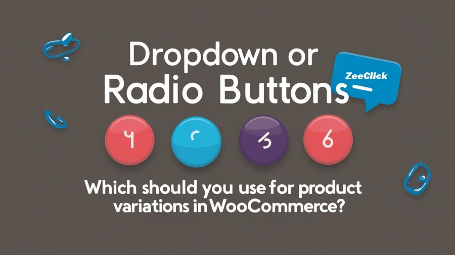
Dropdown or Radio Buttons: Which Should You Use for Product Variations in WooCommerce?
Not every decision in eCommerce screams important, but some of the smaller ones, like how your customers choose a size or color, can quietly affect your sales. If you are selling products that have variability, you are likely to be stuck with default dropdown menus. They are simple, familiar, and get the job done.
But are they the best option?
Many store owners have started shifting toward radio buttons and visual swatches. It’s not just a design choice. It’s about how people interact with your products. The easier and faster it is for shoppers to make a choice, the more likely they are to buy.
And that’s where things get interesting.
In this article, I’ll walk through the pros and cons of both dropdowns and radio buttons. We’ll look at where each makes sense, and why tools like WooCommerce Variation Swatches might help you bridge the gap between boring and brilliant.
What Are You Actually Selling?
—————————-
Let’s pause before we jump into the tech stuff.
If your store products come in various forms. If it could be jacket in 4 sizes and multiple colors, then you’re offering variations. Each variation is a different version of same product. Customers will pick the right one before they can check out.
WooCommerce has a built-in way of handling this, and it’s fine. You set up attributes like size or color, and your customer selects from a drop-down list. Job done.
But when you’re selling something visual like fashion, cosmetics, or furniture, does a dropdown labeled “Sky Blue” or Lime” really show what you’re offering?
That’s the big question here.
Why Dropdowns Still Exist And Why They’re Not Always Bad
—————————-
Let’s be fair. Dropdowns have been around forever, and for good reason.
They’re clean.
If your product has a ton of options, say, 25 sizes or 50 shades, putting all of that on display can make a product page look like a jumbled mess. Dropdowns keep it neat and contained.
They’re universal.
Everyone knows how to use a dropdown. Even if someone’s shopping on a dusty old laptop from 2010, the dropdown will work just fine.
They work out of the box.
WooCommerce doesn’t require any extra plugins or custom work to set them up. You pick your attributes, add your variations, and you’re good to go.
So, yes, dropdowns are functional. But if something works doesn’t mean it’s perfect.
Where Dropdowns Start to Fall Short
Here’s the thing: we are living in a world of rapid feedback and visual cues. Apps like Pinterest or Instagram. Customers don’t want to read labels to understand visuals; they only see what they are getting.
Problem 1: They Hide Options
If you bury your product variations in dropdowns, some customers may not even notice all the available choices. Out of sight, out of mind. And out of cart.
Problem 2: They Slow Things Down
Clicking, opening, scrolling, selecting. Multiply that by every variation a customer has to choose, and it starts to feel like work.
Problem 3: No Visual Guidance
When you’re selling something where appearance matters, a dropdown that says coral or midnight isn’t as helpful as a color swatch.
Radio Buttons and Swatches: Making It Visual
Radio buttons are the old-school HTML way of showing multiple options at once. But in the WooCommerce world, they’ve evolved big time.
Thanks to plugins like WooCommerce Variation Swatches, store owners can now show:
- Color circles
- Image thumbnails
- Text buttons (like S, M, L, XL)
- Even custom icons
And here’s the best part: all of it is clickable, easy to scan, and much more engaging than dropdowns.
Let’s be honest, people don’t want to “select” a color from a text menu. They want to see the color. They want to click the one that speaks to them.
That’s why swatches are winning.
But It’s Not Always That Simple
Okay, before you go installing swatches everywhere, there are a few caveats.
1. They take up space.
If you are offering 20 colors, this means you have 20 swatches on the store page. You will need to think about layout user interface to make sure it looks good.
2. You’ll need a plugin.
WooCommerce doesn’t offer this out of the box. So you’ll need to install something like the WooCommerce Variation Swatches plugin. It’s not hard, but it’s one more thing to manage.
3. You’ll need to prep your visuals.
No point in showing image swatches if the images are low quality or inconsistent. You’ll need to take time to prep your icons or color files so they look clean.
Let’s Compare in Real-World Terms
Let’s walk through a basic example:
You sell: Hoodies
- You offer five color choices: black, olive green, wine red, dusty pink, and navy blue.
- For sizes, customers can pick from small, medium, large, or extra-large.
Using dropdowns:
Your customer selects color → chooses from a list. Then select size → another list. Not painful, but not exciting either.
Using swatches:
All colors are visible as little color bubbles. Sizes show up as square buttons. No clicks to open anything. The customer clicks on olive, image updates. They click large, and they’re done. fast, clear, satisfying.
When Dropdowns Might Still Be Better
Don’t feel pressured to use swatches for everything. Sometimes, a good old dropdown makes more sense.
- Digital products with licenses (Basic, Pro, Enterprise)? A dropdown is cleaner.
- Items with lots of variations (over 15)? Swatches can become cluttered fast.
- Need quick setup and no extra plugins? Stick with the default setup and move on.
When Swatches Are the Smarter Move
If your store sells anything where color, texture, or visual style matters, switching to swatches is a smart bet.
- Fashion
- Home decor
- Beauty products
- Jewelry
- Stationery
These are all areas where showing is better than telling.
And let’s not forget mobile shoppers. Tapping a big color swatch is way easier than dealing with dropdown menus on a small screen.
Some Quick Tips Before You Switch
If you are planning to switch from dropdowns to swatches, keep some important things in mind.
- Don’t go overboard.
Don’t load too many swatches on same page. A clean and well-structured layout helps customers to find what they want without feeling overwhelmed. - Make swatches readable.
Use tooltips or labels. A swatch with no explanation can be confusing. - Check mobile views: Before wrapping up your changes, always ensure to test the layout appearance on mobile devices. Most of visitors like to visit stores or websites through their phones. For this, everything runs smoothly.
- Stay consistent: Use the same style of swatches across your store. This keeps the design layout easy to use and professional.
Final Thoughts: What Makes Sense for Your Store?
If your product options aren’t very visual, like licenses, file formats, or long size lists, then dropdowns probably do the trick. They are easy and instantly set up and keep things simple.
If the appearance of your product matters, like its color, texture, or pattern. It’s better to show those options right away. Letting people see and choose visually makes the decision process feel more natural and less like guesswork.
You don’t need to rebuild your entire store to improve how customers choose product options. A plugin like WooCommerce Variation Swatches can store attractive and easy-to-use. Though it takes time to set but, after this it will make natural browsing for everyone. And buyers can quickly make sense of their choices. They are more likely to follow through with a purchase.